
Image Description
This portrait of Edouard Manet should actually be much more colorful, more colorful. The template was a black and white photo by Nadar. So unlike the previous images in this series, I had to "invent" the colors. Before that, I could observe the template closely and determine the right color tone that way. With this portrait, that didn't work. So I started with the face and oriented the colors to other Manet portraits. The background was to be blue-green. However, this color clashed with the colors of the face, which became visually quite secondary. Therefore, in a second layer I glazed all points of the background again with ocher, so that as a mixed result a kind of ocher green was created.
As always, I could not judge the picture during the painting properly or the remote effect remained a mystery. When I looked at it then from some distance (4-5 meters), I was surprised, not to say frightened, how modern the Manet looks with this dark suit jacket. That was not intended, he was supposed to look like a great pioneer of modernism.
For this I went again through the pictures of Manet. And what can I say: in retrospect, Manet's pictures seem more conservative than before. Maybe I had a wrong idea of him in my head. For a long time, Manet's painting was actually quite conventional. It was the picture motifs that were the cracker at the time.
Whatever: The way the Manet now looks out of the dots picture, he is quite all right. Again, this picture was proof that there's a lot I don't know when I start with a picture like this. And through the discrepancy of close-up and distant effect, I can still learn a lot about my motifs, and thus myself.
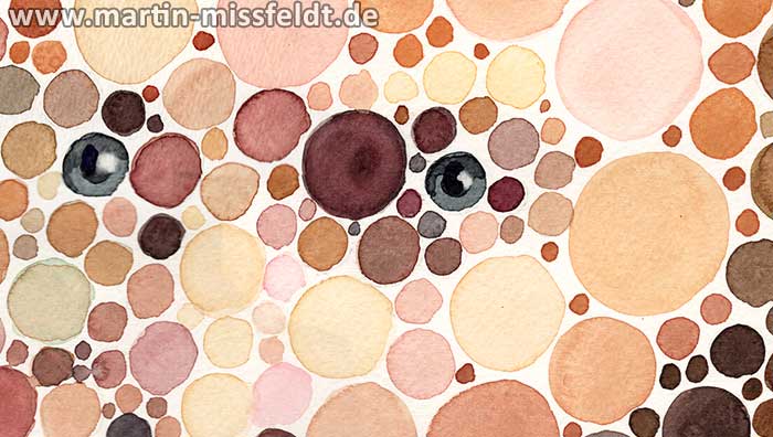
') "Watercolor portrait of Edouard Manet (Detail 1)")
') "Watercolor portrait of Edouard Manet (Detail 2)")
') "Watercolor portrait of Edouard Manet (Detail 3)")
') "Watercolor portrait of Edouard Manet (Detail 4)")
') "Watercolor portrait of Edouard Manet (Detail 5)")